When Billboards Backfire: A Highway 46 Lesson in Design and Perception

I recently took a familiar drive from California’s Central Coast down to the Imperial Valley to visit family. It’s a trip I’ve done since I was a kid—nine hours of long roads, rolling landscapes, and lots of time to think. One thing that’s never changed? The endless stream of roadside advertisements competing for your attention, especially on stretches like Highway 46, where the scenery is sparse and the signs stand out.
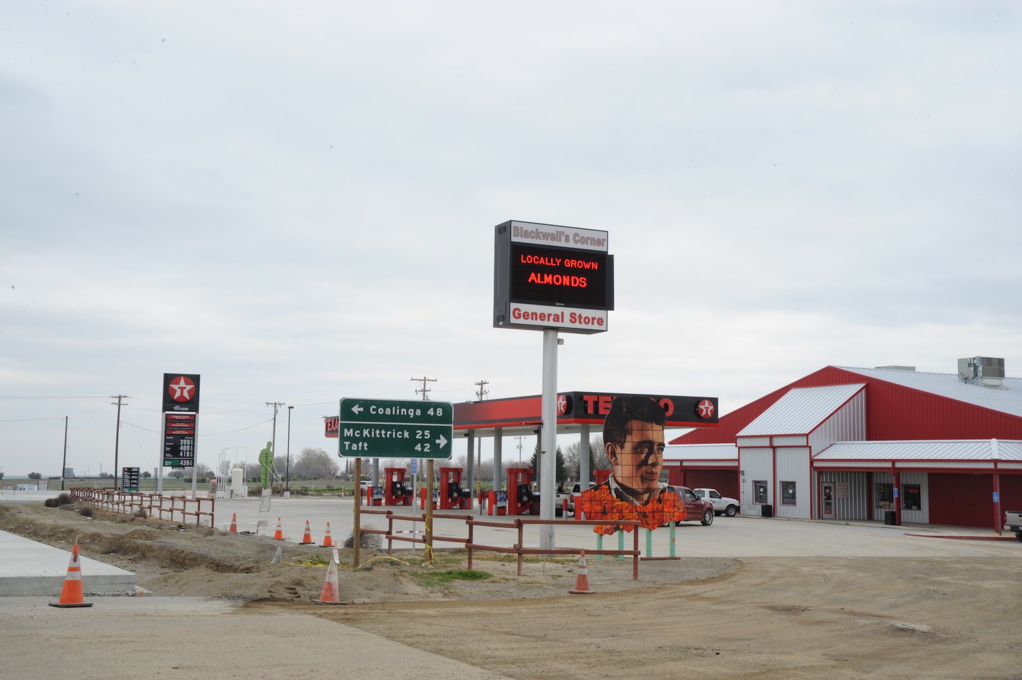
On this last trip, I took note of one billboard in particular—something I’ve passed dozens of times but never really analyzed. From nearly a mile away, it caught my eye for all the wrong reasons. At first glance, it looked like a warning sign—something you’d expect for toxic waste or a quarantine zone.
Turns out, it was a billboard for Blackwell’s Corner General Store—a charming 1950s-style rest stop known for its vintage James Dean and Marilyn Monroe memorabilia (and genuinely good fudge, for the record). But from afar? You’d never guess it was advertising fudge and dried fruit.

Why It Stood Out (But Not in a Good Way)
From a design perspective, here’s what’s happening:
The yellow background triggers an automatic sense of caution—like road signs or hazard warnings.
The bold red font echoes emergency symbols: think hospitals or fire warnings.
The central image, what is actually a nut and fruit platter, reads from a distance like a radition symbol—the kind with red triangles and ominous symmetry.
By the time you're close enough to read the text and see the image clearly, you’ve already passed it. It does grab attention, but not in a way that builds positive brand association. Instead, it introduces confusion, even anxiety, before you realize they’re just advertising roadside snacks.
Attention ≠ Clarity
As marketers, we know how critical attention is—especially in transient spaces like highways. But grabbing attention isn’t the only goal. It has to be the right kind of attention, followed by immediate clarity.
This billboard is a case study in misaligned design intent. It wins the battle for visual priority but loses the war for brand perception and message clarity.
A Missed Opportunity
What’s frustrating is that Blackwell’s Corner is actually a great roadside stop. It's nostalgic, quirky, and rooted in local lore. I’ve stopped here plenty of times and enjoy its quaint charm. The billboard along the highway, however, doesn't reflect any of that personality. With a little design adjustment—more visual storytelling, better imagery, and a friendlier color palette—it could evoke the charm of the store instead of triggering a subconscious flight response.
Final Thought
In marketing, context is everything. A highway billboard isn’t just about color and font—it’s about recognition at speed and instant comprehension. When design choices work against you, even the best fudge along Highway 46 might go unnoticed—or worse, misinterpreted.