Can We Finally Bring Back Physical Buttons In Cars?
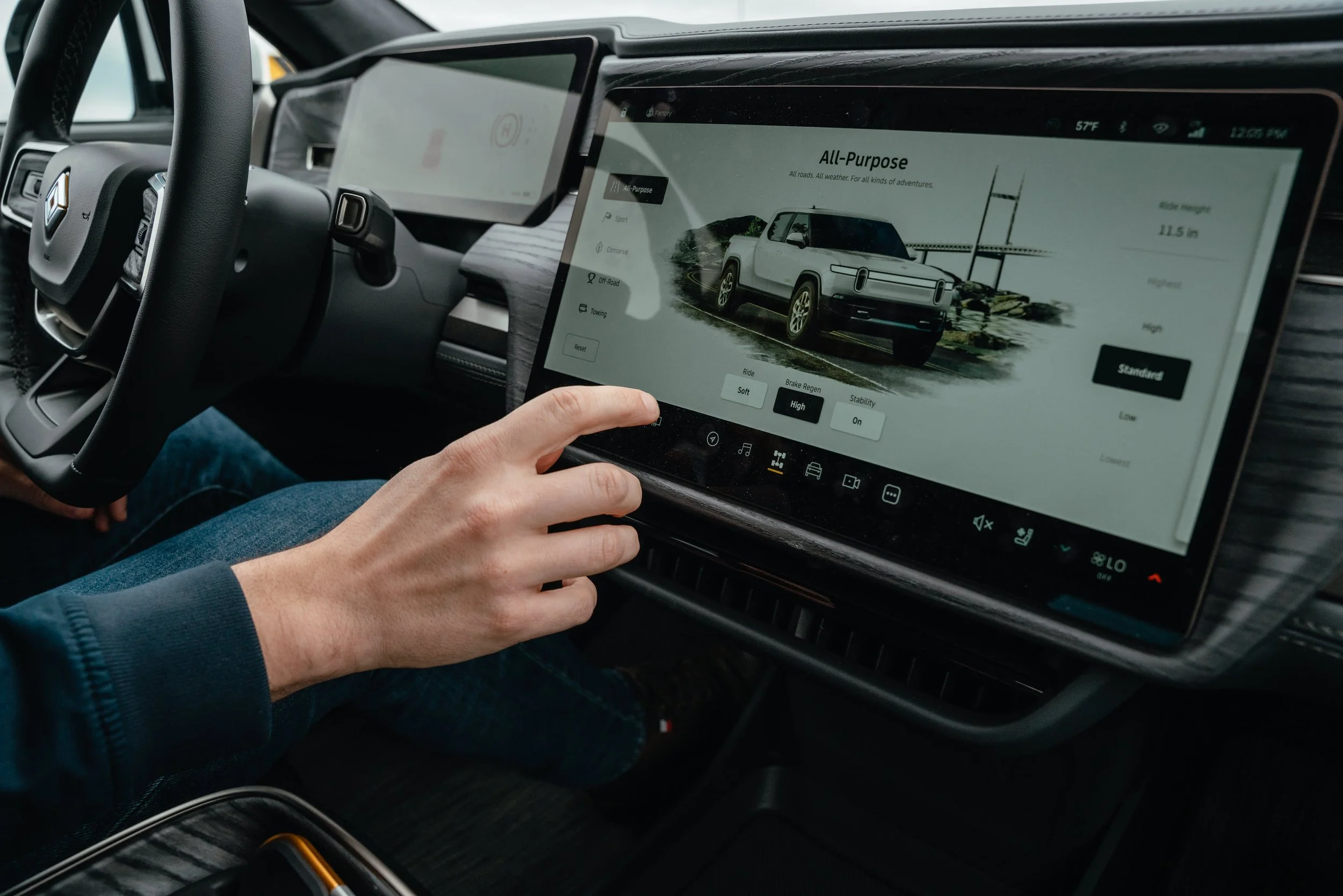
Photo Credit: CNBC
Somewhere between the iPhone launch and boom in Tesla ownership, around 2012, give or take, we lost the plot–car designers got seduced by the shimmering glow of touchscreens. Minimalism became the gospel. Knobs, dials, switches—gone. In their place? Flat, glossy slabs of digital nothingness.
Picture it: you’re barreling down the highway at 75, trying to turn the A/C down, and instead of click, it’s tap-tap-slide-wrong-menu-shit-tap—and suddenly you’re looking at a navigation screen in Japanese. Your eyes leave the road. Maybe just for a second. But that’s all it takes.
All because someone in a design lab wanted your dashboard to look like a MacBook.
We Don’t Need Your Damn Touchscreens
Don’t take my word for it. Let’s talk facts.
A massive study by What Car? showed nearly 90% of drivers prefer physical buttons over touchscreens. Safety was the #1 reason. No surprise there. Buttons don’t move. They don’t lag. You don’t need to look at them to use them.
A Swedish magazine, Vi Bilägare, ran real-world tests. In cars packed with screens, simple tasks like turning on the defroster or changing a radio station took four times longer than in cars with real buttons. Four times. On the road, that’s the difference between alive and a roadside memorial.
Euro NCAP, the group that crash-tests cars in Europe, is about to start punishing manufacturers that ditch physical controls. As in: you won’t get a five-star safety rating if your climate control is buried in some touchscreen labyrinth.
Let me spell that out for the marketing departments: even safety regulators are sick of your UX.
Designers Got Lost in the Sauce
This isn’t about being anti-progress. I love good display screen. Sometimes a good design requires a touchscreen. But let’s be honest: somewhere along the way, we started designing cars for showroom photos and the latest techCrunch article, not for real people with sticky fingers, sunglasses, and a screaming kid in the backseat.
Design is supposed to solve problems, not create new ones. It’s supposed to anticipate your needs—not bury them behind a sub-menu and a software update.
The truth is: buttons are beautiful. They have weight. They have memory. You feel them. You build a relationship with them. They don’t change location when the software updates. They don’t freeze.
Simply put: they work.

Photo Credit: Reddit
Car Companies Are Finally Owning Up
Volkswagen, the same folks who opted for sliders and haptic feedback in their ID.4, recently backtracked. Hard. They're reintroducing real buttons for volume, climate, hazard lights. One exec even admitted:
“We will never, ever make this mistake again.”
Promise?
Subaru, Hyundai, Volvo—they’re all dialing it back. The tides are turning, and automakers that want to lead in anything more meaningful than quarterly hype need to stop chasing Silicon Valley’s ghost. This isn’t about who can cram the biggest screen into a dashboard or who can pretend their sedan is a rolling iPad. It’s about who’s willing to actually listen—to drivers, to data, to common damn sense. The brands that get it will be the ones who build cars for humans, not demos. The ones who realize leadership isn’t just innovation—it’s relevance, usability, and the guts to admit when the design went too far.
What This Says About All of Us
Here’s the bigger truth, the human truth:
We keep chasing sleek and shiny. In tech. In cars. In life. We worship minimalism until it starts killing us. We shave off the rough edges and realness in favor of smooth surfaces and sterile design. But underneath it all? We miss the noise. The feel. The feedback. The real.
So yeah—bring back the buttons.
Not because it’s nostalgic. Not because it’s trendy now to be “retro.” Bring them back because they work. Because they remind us that good design is invisible, and safety isn’t supposed to be sexy.
Takeaways:
Digital’s not the enemy—but it needs boundaries. Use touchscreens for maps and playlists. Leave climate control and hazard lights to real-world physics.
Safety is tactile. Muscle memory matters. You should be able to hit the defrost without pulling your eyes off the road.
Good design isn’t about what you can remove. It’s about knowing what should stay.
If your interface needs a manual, you’ve failed. You’re not clever. You’re creating obstacles.
Final Thought:
There’s no badge of honor in designing a car like a smartphone. People don’t want to pair with their vehicle—they want to drive it. Feel it. Trust it.
So let’s kill the noise. Bring back the knobs. Put the human back in the machine.
And please, for the love of all things analog—bring back the damn buttons.