The Genius of Pringles’ Product Design and Packaging
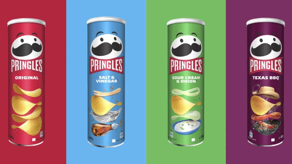
Photo credit: Tribu
In an industry dominated by loud bags, Pringles deviated from the norm and became unforgettable for it. With a uniform, saddle-shaped chip and a sleek cylindrical can, the brand carved out a unique position in the crowded snack market.
But this wasn't just a quirky design choice. It was a calculated, strategic move — one that’s become a case study in product innovation, packaging design, and brand differentiation.
As marketers and creative leaders, there’s a lot we can learn from how Pringles turned form into function — and function into fame.
The Power of Shape: Why the Pringle Isn't Just a Chip
Let’s start with the product itself: the Pringle’s curved, stackable shape — technically a hyperbolic paraboloid.
From a design and marketing perspective, this shape accomplishes three key things:
1. Uniformity That Reinforces Brand Identity
Every Pringle looks the same — and that’s intentional. In a world of unpredictable chip sizes and textures, Pringles communicate consistency, quality, and precision. This physical uniformity becomes a brand promise: every bite is exactly what you expect.
2. Functional Superiority
The shape allows for efficient stacking, minimal breakage, and even cooking. Consumers don’t need to shake a bag for intact chips — they’re all right there, perfectly stacked. That adds value without changing ingredients or price point.
3. Iconic Memorability
The shape is so unique, it becomes a memory trigger. It’s not just “a chip” — it’s a Pringle. That visual and tactile distinctiveness sets the brand apart at shelf and in culture.
The Packaging: More Than a Can — A Strategic Brand Asset
Pringles’ cylindrical canister is instantly recognizable — but also brilliantly utilitarian.
Here’s what makes it a packaging masterstroke:
✔ Protection & Freshness
The can’s structure protects chips from breakage and preserves crispness longer than traditional bags. The experience of freshness becomes part of the product's brand equity.
✔ Stackability & Shelf Presence
From a retail perspective, the canister is a dream: stackable, clean, and impossible to miss. This disrupts the visual noise of the snack aisle and commands attention.
✔ Environmental & Economic Efficiency
Though not without its critics, the packaging uses less air, less plastic, and ships more efficiently — a logistics win that aligns with modern sustainability narratives.
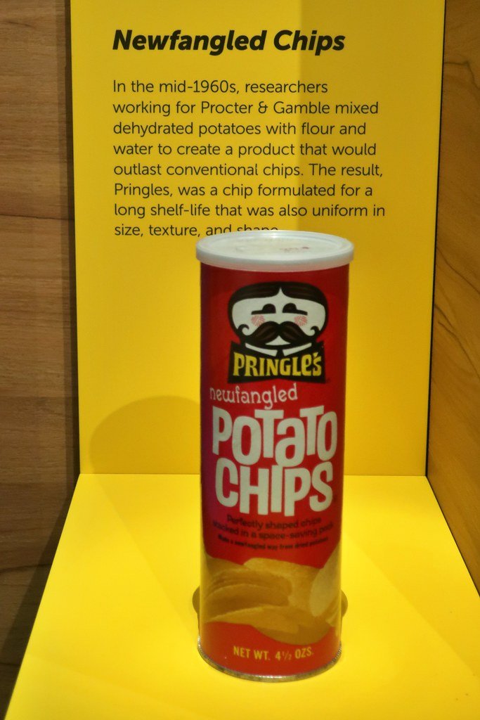
Photo credit: Flicker
What Marketers Can Learn from Pringles
Pringles is more than a snack — it’s a case study in holistic brand design. Here are three key takeaways for marketing and creative professionals:
1. Product Design Is Brand Design
Smart design isn’t just aesthetic — it’s strategic. When the product physically embodies the brand’s promise (like consistency, precision, or fun), you’re not just marketing an idea — you’re delivering it.
2. Packaging Is a Storytelling Vehicle
Don’t underestimate the power of form. Pringles' can tells a story: of innovation, differentiation, and trust. Great packaging reinforces positioning, elevates the unboxing experience, and increases memorability.
3. Break the Category Norms (With Purpose)
Disruption isn’t about being loud — it’s about being different and smart. Pringles succeeded by challenging the expected in ways that improved the consumer experience. Innovation for its own sake is noise. Innovation with utility? That’s strategy.
Final Thoughts: A Design Worth Emulating
In today’s landscape of cluttered markets and shrinking attention spans, Pringles reminds us that smart design is a business advantage. Whether you’re leading brand strategy, launching a product, or rethinking your packaging, the lesson is clear:
Think beyond the visual. Think functional, memorable, and strategic.
That’s how you turn a chip into a global brand.
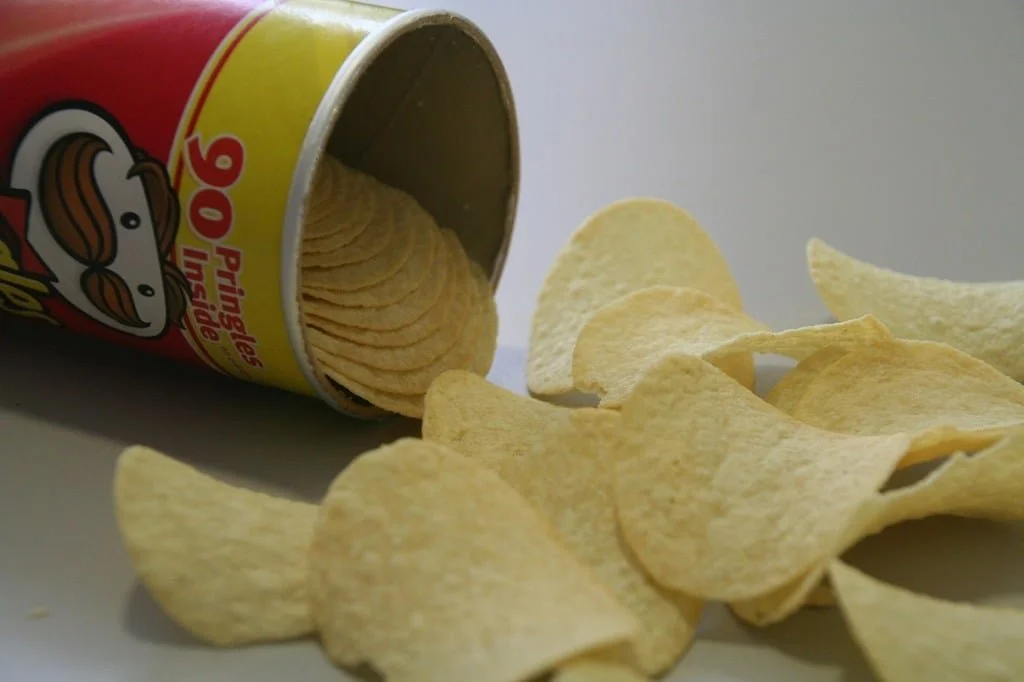
Photo credit: Wikimedia